SUNSHINE DAYS ✨ NETSPEAK GAMES ✨ november 2019 - November 2022
Project: A non-violent F2P social GAAS title for mobile, with a wholesome and cosy feel. I started working on it from conception to live game. I joined when the company when it was 6 months old as the 1st UX hire and established a UX/UR pipeline.
Responsibilities: My role spanned UX/UR at the studio and involved all things UX Design (unpacking the problem space and writing feature proposals, designing interactive prototypes to align development goals and evaluating the ideas of the UI/Design team etc.) and User Research (established a playtest pipeline, uncovering audience insights and conducting design reviews to ensure choices match design intent etc.).
Tools: Figma, Adobe XD, Protopie, Miro and Unreal Engine
Summary of contributions to develop a player-centric design culture
During my time at Netspeak, I was involved in the shipping of 2 games in 3 years. A focus of mine was supporting the team across disciplines by integrating UX processes across all stages of development and minimising the chaotic impact making games can have by creating a shared understanding of player experience. There were huge challenges to deal with (new audience, new game genres, new team, working in start-up) and I regularly evaluated opportunities for quick UX wins whilst balancing designing core features for Sunshine Days and evangelising UX for alignment for decision making.
✨ If you want the TL:DR; I was part of a panel where I discussed how to build a UX process from the ground up for small to mid-sized studios ✨
Designing core features and having a broad impact across the game
I was able to impact most player-facing features in the game in some shape or form, whether that be planning, designing or playtesting with players. During the planning phases, I would join feature meetings, outlining UX needs, pain points and goals. Other times, I would do design analyses of competitor titles to find common UX trends and opportunities.
Throughout development I supported the creation of design documentation and collaboratively devised prototypes that got very strong positive feedback from players (e.g character customisation and emojis). Other times, I was involved in defining feature specifications for core features (HUD UI and FTUE), and worked closely with the business team to produce new feature idea proposals that were used to initiate ideas in the design team (e.g. Community Goals and Consent to tracking data pop ups).
This has been a good opportunity to experiment with different UX methods. Being in this role has meant I have learnt to speak the language of teams by running workshops and meetings that reduce the time spent fixing problems and instead planning effectively through clear communication and collaborating with production.
✨ I did a talk about how Game Design and UX Design work well together (and how we should collaborate more)! ✨
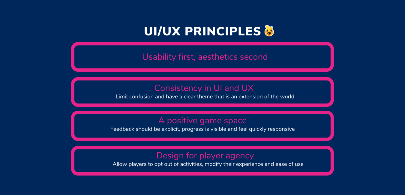
Current UI principles for the game
Collaborating on defining the UI Style and UX principles
I’ve spent time with the UI team and with UI outsourcers on an ongoing basis to update and review the UI style guide to ensure aesthetic and in-game UI decisions are accessible, usable and consistent. Tasks have included: designing mid-fidelity screens and mapping requirements, reviewing icons and assets and giving input on colour, shape, fonts and more.
This stemmed from observing that there was a lack of initial standards and no design system for non-UI developers to prototype with. The latter is still a WIP and we used Atomic Design Principles to decide on UI requirements for efficiency and collaboration.
built a user research department from scratch
A tough but enjoyable endevaour, I kickstarted a playtesting process and efforts for regular audience insights. Working at a small studio meant I had to come up with quick, accessible but effective methods of conducting and delivering research that was then translated into actionable recommendations. Research was a huge part of the pitch for Netspeak’s growth and I understood the responsibility it held. I was able to consistently deliver research insights to investors and the strategy teams that impacted the development of the game as well as studio culture (1 UI lead and Senior UR were hired during my time after it was seen just how valuable UX is).
I started with running regular playtests and interviewing our users so that we could learn about our audience. Over time, by remaining consistent, it improved the validity of research which was a win for me and met business needs of wanting research results fast.
My goal was that all features involve an element of research for inspiration and testing for validation.
I worked closely with QA and Production to come up with a process to prepare and release builds for usability and experience playtesting. This resulted in playtesting being included as part of every sprint, which I’m proud of!
Some cool things that happened:
For internal playtests, I would collaborate with the game design team to test a prototype for key UX issues. It enabled rapid iterative prototyping which was intense and exciting as some tests required a same day turnaround! In some instances, I would work with the feature lead to devise playtest questions and support them with analyses of results after. A big focus with this project was to make developers feel empowered to engage with player data and the hands on experience of testing enabled them to value the results better.
For external testing (with our audience) I utilised a variety of research methods, including watching players play the game then ask questions, testing in Discord, concept testing and cross-affinity analyses. These helped steer art and narrative direction, rework the FTUE which resulted in more players completing it and support the delivery of long term goals. I also came up with a template that the game designers could use to analyse playtest data.
I had an awareness that development was quick, iterative and required answers from UX ASAP. I did not deliver huge research reports (only sometimes) but instead would write 1 page summaries that would be shared with leadership with design recommendations. The detailed version of the reports covering issues raised during testing was shared with the development teams to come up with solutions together. I often delivered reports on a miro board or presentation, with lots of post - it notes and colour to make research feel exciting to engage with. I was focused on presenting information but also having the design team interact with the insights. This helped better UX understanding at the studio and brought people face to face with the players.
Devised the company’s 1st accessibility plan to ensure diversity of experience
We had spoken to our player base to get insight on what accessibility and diversity mean to them which has enabled us to consider them from the start of development through: decisions on the UI, character customisation and player communication options (emojis!) and narrative concepts. For one milestone, I devised an accessibility plan e.g. what settings options to include and devised documentation such as ✨onboarding best practices✨ based on competitor analysis.
Here are some of the different projects and skills developed over time.
Persona Development
Challenge
When I first joined, there wasn’t a clear understanding of the audience’s relationship to games, specifically mobile games. We knew that a decent proportion were gaming, but we were unclear about what games they play, their gaming habits and if there was a gap in desired experiences that competitor games weren’t fulling.
I decided to conduct research on the intended audience and devise personas as means to translate data, alongside starting with a UX tool that the team and CEO were aware of (enables easier buy in) and develop a common language about who our users are in order for us to better translate design intent.
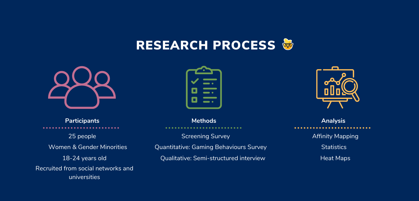
Research Objectives and process
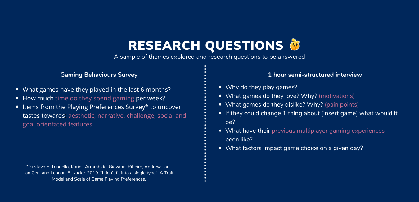
To understand who are our players and answer if the type of game we are making something they are looking for. It was important for me to see the players as actual people and understand why and how games fit into their lives. I asked a broad spectrum of questions to learn about their their lifestyles, well-being and hobbies beyond games.
Unpack audience gaming behaviours, motivations, needs and pain points within this genre space.
Assess what needs do and don’t competitor titles fill. Can we meet those?
Deliverables and Impact
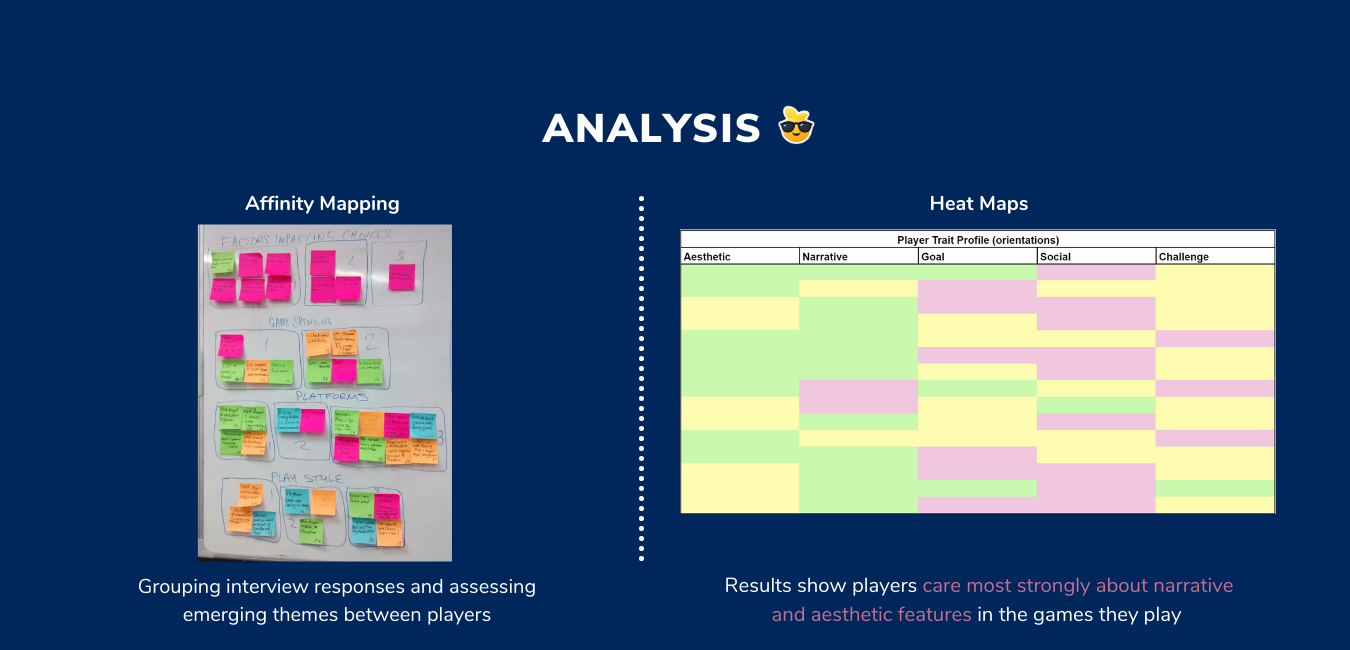
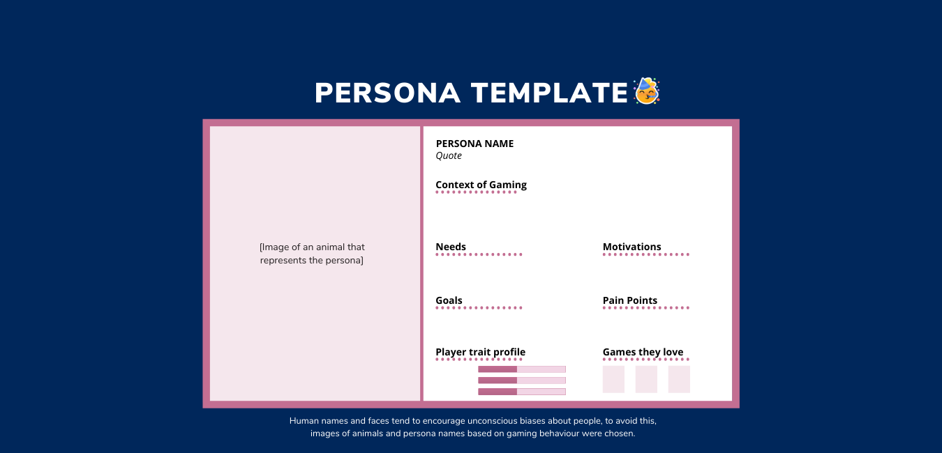
Discovered 3 personas and 1 anti-persona. The project validated that we were aiming the game at the right audience and identified clear common needs and motivations across the group. These are now used consistently when developing new features to ensure player needs are considered and features are scoped appropriately.
Delivered a presentation and led a workshop to present the personas. I had the team label each persona by giving them: a name, a quote and a mention of ideal games. These were then ordered in terms of primary, secondary, tertiary personas.
Have regularly produced detailed insights reports accompanied by actionable design recommendations and used to supportive investor decks. Speaking to players on a regular basis has meant we have been able to go indepth with regards to audience insights, which are used to inform the game design pillars, game narrative and feature development.
Since this initial project - over the years we have shifted to looking at users within behavioural segments over demographics and incorporated a lot more data analytics!
DEfining the CONTROL SCHEME - How do players expect to make an impact?
Challenge
Interaction and feedback are a core part of the game, especially as the world is vast, encourages exploration and has lots that the player can interact which impacts their overall experience. We had to answer what system would suit best for a: landscape mobile phone orientation, casual gaming audience and slow paced experience? This was a feature that had some mockups but primarily prototyped heavily in engine with collaboration from design and programming teams.
Research
To start off with, I ran a workshop with the design team using an interactive board where we added inspiration and references from a) mobile games the audience plays and b) mobile titles to map common interactions, possible pain points and interaction types. Questions I asked whilst breaking down competitor titles during our discussions ensured we covered usability, learnability and business goals:
What interaction type(s) are used to initiate an action and what feedback does the player expect? Are certain input methods tied to specific actions?
What affordances does the game provide to show where, when and how to interact? How clear and explicit are these?
What copy is being used to encourage or discourage an action? Is it easy to understand?
How early in the game experience does the player learn each interaction? Is this ever built upon and revisited?
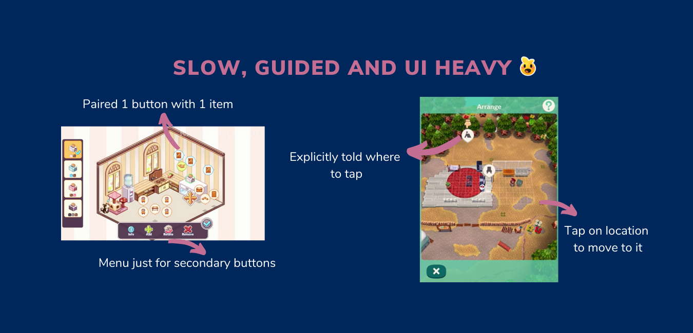
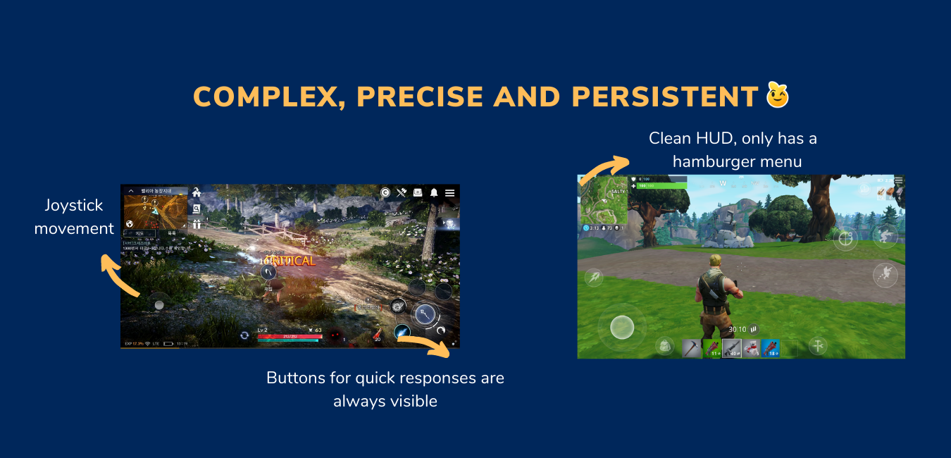
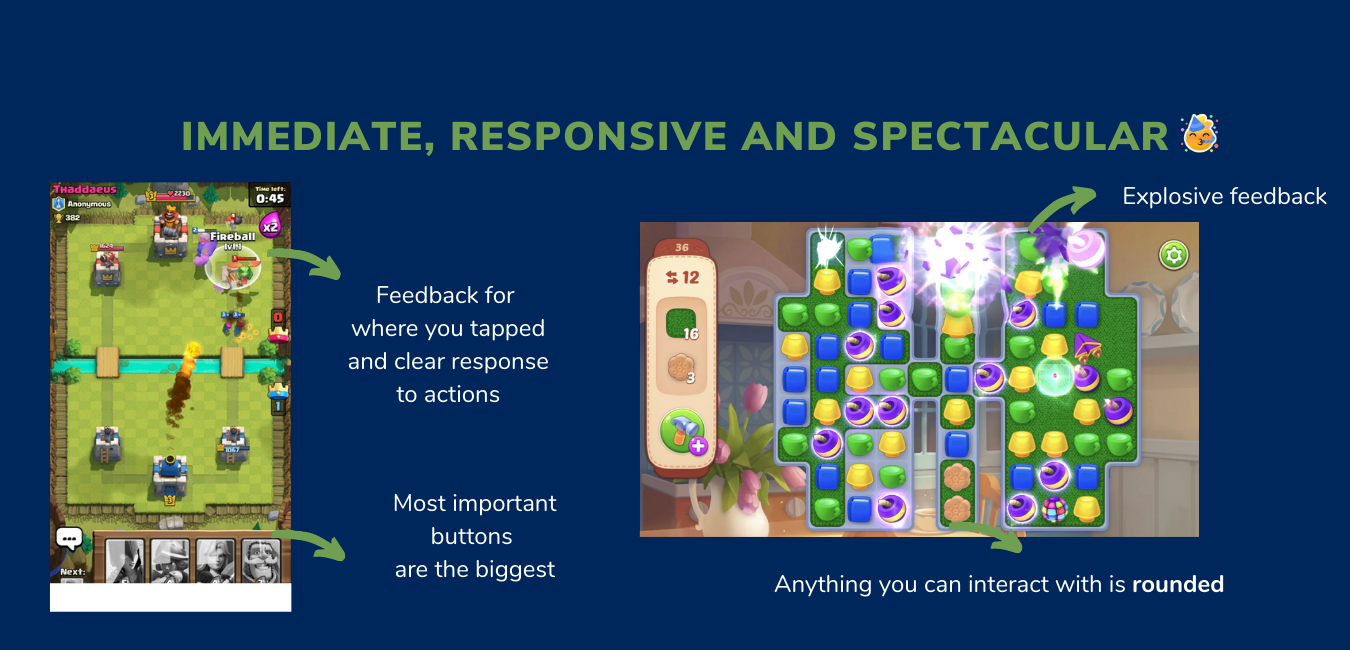
We identified three different types of interaction patterns (above) from which we decided on clear IXD heuristics for the game. These worked to help us scope future design decisions and ensure we maintain consistency in design. These include:
Scrapped idea for the interaction system: Buttons appear above object of interest
All buttons must be teachable on first glance (affordances)
Clear highlighting of selected item before taking the next step
For bigger open worlds, a joystick enables varied, precise movement
Feedback for input should be bold, fast and clear
CONCEPTING IDEAS
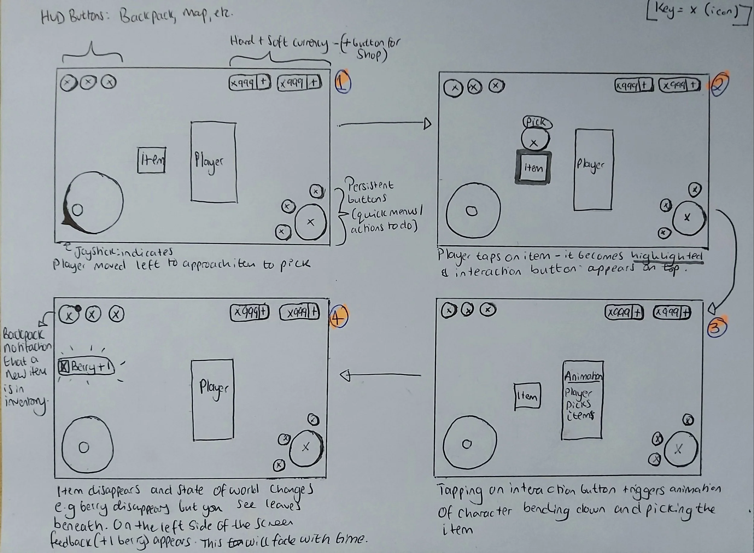
We spent time exploring different interaction models. On the right is an image of a scrapped idea whereby a button will appear above an object of interest that you want to interact with. We did not continue with this idea as it would require the player to tap multiple different areas on the screen. Keeping input points to the bottom third and in the corners was more consistent and would require less effort on the players end.
Movement and interaction concept that we decided to test- Players tap on an object of interest, this becomes highlighted and interaction options appear on the bottom right.
Hypotheses
Framing a design solution as a hypothesis enabled us to see it as testable and unfixed, to highlight that this will be iterated upon and should be. In this case we stated that an interaction system that consists of the following input methods will meet player needs for interactions:
a joystick on the bottom left - This allows the player to roam freely and precisely over long journeys, changing course on their own terms
an interaction button on the bottom right of the screen - There are multiple ways to interact with an object (use, inspect, remove etc), we can show them all at once and the most prioritised one is biggest.
In the playtest planning meetings we discuss the topics mentioned here. After this, I collate notes and draw up a more detailed plan where I think about the post-task questions.
Playtest planning
Before a playtest is conducted, I hold a meeting with the Creative Director, Producer and CEO to create a common ground about what is being playtested and setting expectations of the deliverables.
Playtesting results
Typically reported results are given a priority ranking from both a usability and production perspective. I use the reporting format of (severity level, issue, cause, impact).
Most players attempted “tap to move” as the initial input to move the player character, they eventually, through exploration learnt about the joystick movement which they naturally moved onto after. Evidence showed a lack of clear tutorialisation of the feature, resulted in players taking longer than expected to learn it. Plus, upon seeing an NPC who indicated they wanted to talk, players assumed tapping on the NPC directly would move the character towards them.
Most players did not notice the bottom right interaction buttons. They would tap directly on items of interest and did not notice these buttons pulsate to indicate they could engage with them.
The use of “footsteps” to guide players was confusing and did not aid navigation as well as we wanted it to.
Iterations
Above shows findings from one of many internal and external playtests where we tested and refined this feature over the space of a few months. We went back to the drawing board and for each problem mentioned we thought about how this would scale with more features to be added, how do we avoid cognitive overload with high amounts of on screen information present and allow different modes of input for accessibility purposes.
Changes implemented
FTUE tutorial was updated to teach players how to use the joystick and the core buttons in the bottom right. Playtesting with players after this change resulted in a decreased confused sentiment about how to interact with the game. I recommended a pointing hand shows key buttons, arrows should guide navigation instead of footprints, that the player is made to use the joystick to get more content and to give a task so that they have to use the buttons on the bottom right (see video). This led to improved positive sentiment from players during playtests and reduced drop offs in the FTUE funnel]
I pushed for the inclusion of ‘tap to move’ movement as an option to better interaction accessibility. Players will be able to pick this control scheme via the settings menu but would not be the default. I worked with a programmer to have this implemented, it was then tested with players where the feedback reaffirmed that including it will be enjoyed by players. I used this playtest data to make the case for the inclusion of this additional input method.
Lessons Learnt
Be aware of how decisions for 1 feature impact the overall game and its systems. Working on the interaction system was a great way for me to learn about how this would set the foundations for future feature designs going ahead and I got a high-level picture of the game vision through it. Asking questions about the wider experience allowed to find common patterns of issues of which could be solved though a solution.
Internal testing is invaluable. I worked with a team who have a history of working on multiplayer titles, their experience had been useful to better understand the usability of the feature. Testing whilst asking UX questions enabled me to build a rapport with the technical team and they learn what questions they could be asking when tweaking, balancing or designing the tech behind a system.
Signs and feedback - notification ui
Updating the feedback system was an interesting area for me, through iterating on the FTUE, it was noticed that there was unclear and missed feedback when picking up an item. This rose further questions such as, what about when players get a quest update, is it important for them to know about this via a pop-up especially if they’re busy doing another task or could we use another method?
I designed feedback UI that appears on the left side of the screen when a player collects something or for non-essential information.
[Left - Initial prototype of item collected feedback via toast notification] [Right - implemented in-game version by the UI team after some iteration]
impact
The far left side of the screen from here on was designated for ‘passive’ feedback, where the player can see it but it doesn’t distract them a lot if they’re engaging in a task as it is in their peripheral vision. This works as an adequate consistent solution for feedback on item collection, quest updates and nudging towards new notifications.
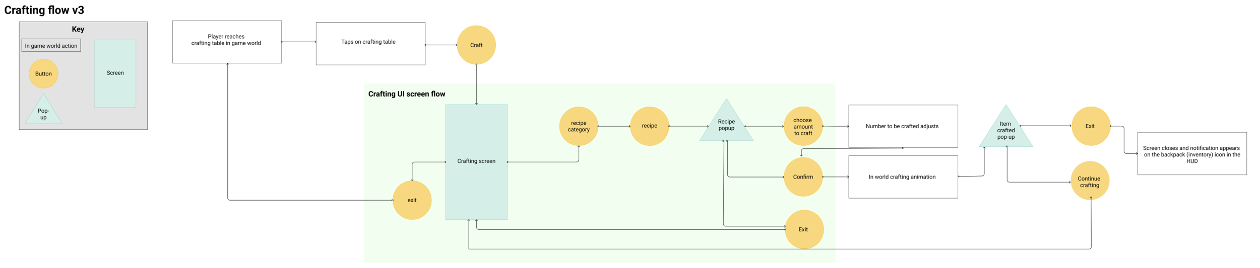
Evaluating protoytpes and redesigns - crafting MEchanic
Challenge
Crafting is a mechanic taught fairly on the in the FTUE as it is an integral part to progress in the game and was one of the first mechanics we developed. The feature was initially designed by the UI team and after user testing, I had them join me in reviewing key issues found through live data as a collaborative task so that they gained better insights into the playtesting process. User centred solutions were then designed by myself by unpacking the problems raised:
Crafting menu UI: Players are unclear about a recipe’s details. Copy was too small to read which prevented them getting further information about them.
Crafting flow: Because recipes are not in the inventory, players are unsure of where to go to find information about what materials are needed for crafting recipes.
The above two led to a negative impact on the overall experience: players spend a lot of time searching for items that are actually recipes, others drop out out of frustration and average completion time rate was skewed towards spending a long time attempting to find items of interest.
I used the following process to solve this!
Getting context & MARKET research
Before I got into the redesign I reviewed the initial feature brief and broke down the previous design to understand its strengths and improvements. I asked open questions such as:
What are the primary and user design goals?
What problem is this feature trying to solve?
Why was this flow and layout chosen?
What were the constraints, systems and deadlines in place etc.?
How will this impact other systems?
Research was conducted on competitor titles, breaking down their crafting flows, UI and choices (left image). For each game’s take, I look at the UX pros and cons to look observe what works well and areas of opportunity.
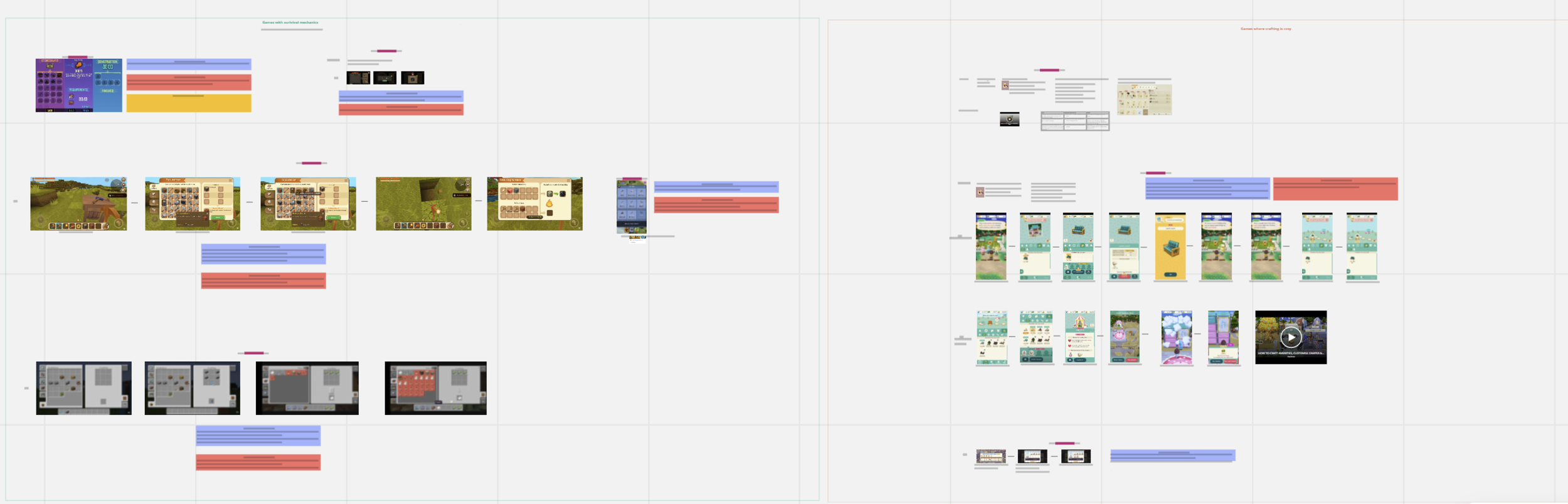
Snippet of the market research presented on a MIRO board to the team!
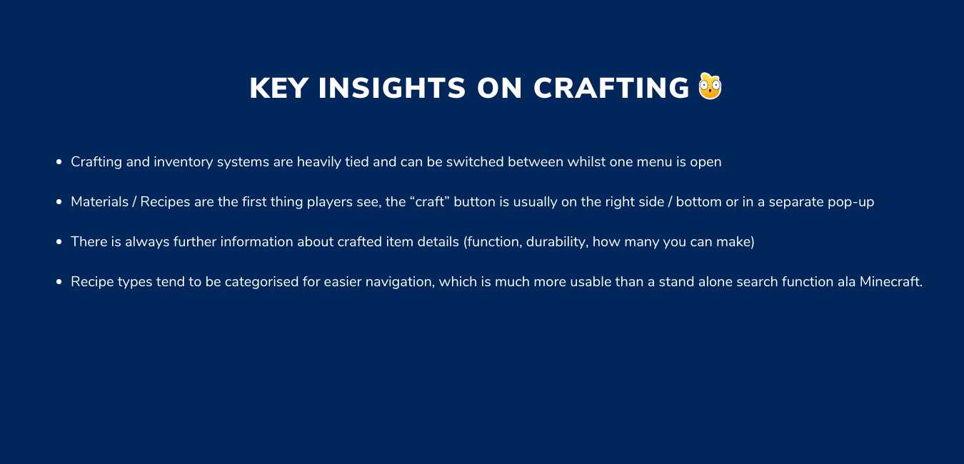
Competitor research was condensed into common patterns and areas of interest
reframing the problem and ideation
“How might we” stories were used as a method to turn research results into design opportunities. They enabled us to visualise what the player goals may be and enecourage brainstorming of solutions.
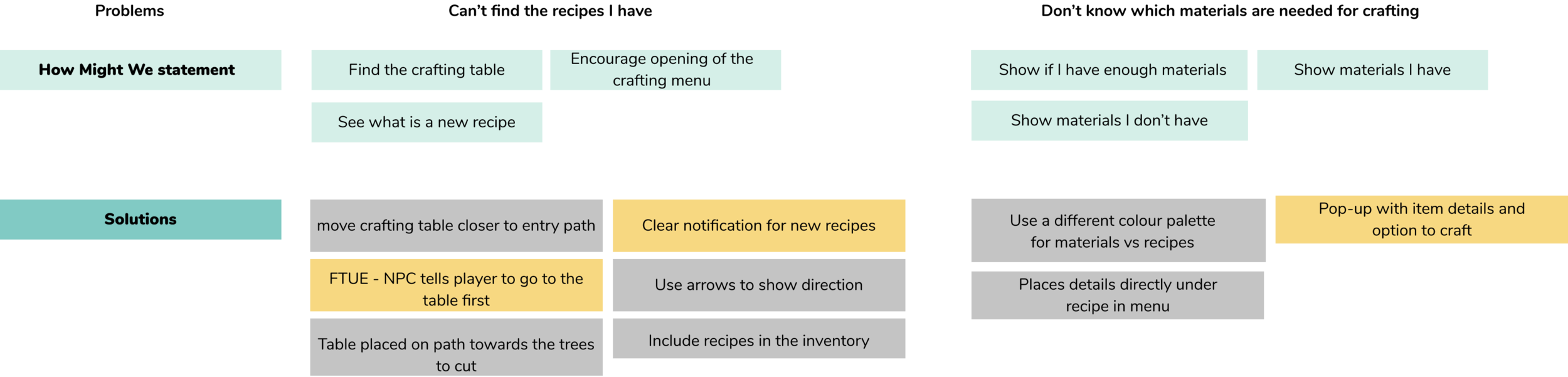
It was through this that I realised problems 1 and 2 were heavily related - with players wanting to know about materials needed before exploring. I created a flow to map out an updated journey whereby in the FTUE, players are encouraged to check their recipe details before going off exploring to find the materials needed.
The design goals here were:
Make it easier for player to find out what crafting materials they need before they explore the woods (improve readability)
Have a clear indicator of their task and how to use the crafting table the first time they enter the woods
Minimise average time taken to complete the FTUE that skewed heavily towards the higher end because of the confusion with this mechanic
Each tweak that involved an asset or flow change was discussed with the team. Together we used the MoSCoW method to break down the design based on effort from the team vs impact to the player.
wireframes and Prototype
I like to sketch by hand first, as a means to explore ideas without the restrictions of a tool before making narrow decisions. I scribble lots and write all over my designs, as it helps me think through my decisions. I then go into Figma and make a flows and wireframes as shown here. There were lots of ideas discussed and discarded here till we devised an appropriate solution.
Flow showing the FTUE of this feature. Player talks to NPC who gives them their first recipe and hints to them to go to the crafting table.
Breakdown of UI decisions with reference to how these meet player and business needs
IMPACT
With time attempting to craft was no longer the biggest pain point in the experience. Qualitative sentiment shifted from “I can’t tell what I have” to understanding if they have enough for a recipe and how much is needed.
Exploration was intentional and about curiosity instead of confusion. Quantitatively, we saw players spent less time confused about what they had to collect and instead focused on exploring the woods to find them. This portion of the FTUE therefore took them less time to complete than before.
What I would have wanted to do next
Run a card sorting task with users to see if the current way recipes are categorised are the most understandable and if these requirement adjustment - e.g. renaming, changing the icons or number of categories
Review opportunities of ways this feature can interact with other game systems e.g. should there be a tab for the inventory / backpack on the bottom left? How does this now change the experience?
Work closely with the commercial / data team to see what role this feature will evolve to play in a F2P environment. Do we need to add a button in this flow to easily access the shop if the player doesn’t have enough resources?
Make the outcome of crafting feel rewarding. It is a similar issue in some competitor titles, the item you craft should be shown off beyond a static pop-up. I would like to look into UI animation and feedback to make this feel exciting.
Since the development of this feature, we have defined rules about how pop-ups should be utilised (the different types that can appear) and have decided that menus should be a full screen experience. Because of that, I would change the layouts to match the new style.
Gardening Mechanic
NB: This feature was prototyped prior to the inclusion of levelling and a defined interaction system. I worked with a UI Artist (Tatiana Shamova) and Technical Designer (Tesh Samuels) on the initial version of this feature, however we relied on regular design critique from the wider team to iterate.
Challenge
This feature would be present in the player’s greenhouse and would serve as a soft currency tap and appointment mechanic. Key questions here centered around how to get the player to return, how to make this feel calming rather than frustrating and how to minimise complexity of interaction flow for solid understanding of how to engage with gardening.
feature planning
Player goals were mapped out using user stories. There was an overarching core goal, that was then broken down into smaller, but important tasks for different stages of the flow. These were then prioritised to help map out technical and asset needs for the feature. The personas were used to ensure a spectrum of needs were covered.
Concepting and evaluating solutions
User stories supported the development of the proposed flow for the feature. The main problem area was around what the seed inventory UI could look like with the technical and business caveat that new assets should be minimal. Multiple UI and screen options were prototyped. Initially with the idea to allow expression of all possible solutions before settling on one. Each concept was evaluated in terms of usability (pros & improvement areas), experience, technical needs and more.
Examples of mocked UI screens that were discussed with the team, feedback was applied to decide on a solution together.
For the chosen solution, I noted how it solves problems noticed in previous concepts (issues) and what changes have been made this time (changes).
Prototype
impact and What I learnt
Most players were able to successfully complete the flow - This is from triggering the event to harvesting a plant. There was some slight issues around players tapping on the seed pouch to plant the same of a crop, because they missed the counter. Some later iterations worked to solve this.
Plan out the MVP then scope up with milestones - Design a core gameplay loop that is still fun then think about "this set of mechanics for MVP in six months, feature X in three months after that") etc.. This way of thinking has suited the fast paced nature of development and allows rapid iteration without huge commitments from the beginning.