Stampede: Racing royale ✨ sumo digital ✨ jan 2024 - current
Project: A 60-player racing and battle royale game for PC and Console.
Responsibilities: I was focused on developing new features working end to end of the UX development pipeline (brief creation, prototyping to solve complex design problems, setting up and engaging in playtesting) as well as starting to explore Unity. Having worked in a cross-functional team, I’ve had to make sure designs are adaptive, iterative and accessible with consideration for brand safeguarding.
Work: Most of my work is currently under NDA. However, I focused on gameplay and maintaining design consistency for better player experiences.
Approach and Contributions
For Stampede, we wanted to blend the accessibility of a Mario Kart-style game with the Battle Royale genre to create something for a broader, casual audience. The goal was to introduce UI that was seamless, intuitive and fun to engage with. We went about this in a multitude of ways:
Standardising the UX
Worked closely with the senior UX designers to create a design guide in Figma with UI assets and standards. This created a repository from which we could quickly create wireframes and prototypes from. Screens were designed to be intuitive where usability and player engagement were at the forefront. Factors such as resuability, simplicity and scalability were considered.
An iterative, data led process for creating design artifacts efficiently helped us to be successful. I worked closely with product managers, game designers and UI to decide on the design tool to use to drive shared alignment and collaboration. These could be wireframes and prototypes as well as design briefs and UX reviews. For each feature, player navigation, designer intent and production capabilities were considered and in turn this allowed us to create interaction and visual consistency.
As the game was released on multiple platforms, we focused on making sure accessibility remained consistent across platforms and interaction models were tailored to each.
User research at every step of the design process
Created internal playtesting process using Miro and Microsoft Forms. This enabled us to get feedback from the broader team, map out key areas of improvement and create a backlog of UX work to do. It was enjoyable to lead playtesting sessions and create reports to share with design, product and UI leads.
Synced with the Tencent User Research team to confirm testing requirements, analyse data together and create reports that were accessible to the wider team. This enabled a quick turnaround of player feedback and I was able to have a say in what issues to prioritise from a UX perspective.
I spent time with product managers conducting market research on the design, functionality and UI choices of competitor titles. It was important to undersand what the gaps are in the market and what the target audience enjoys. As we were aiming to bring racing to a more casual audience, this ongoing research helped us build a body of player knowledge to shape UX rules, opportunity spaces and future possible features.
WIREFRAMES
HUD Improvements
My priorities when working on the HUD was to make sure it was easy to read, explicit and bold in its aesthetic. We ensured this through:
Creating a responsive HUD that was explicit and clear about the current status and requirements of a player. This meant players can focus on the race, and their attention was only directed to certain HUD elements if it was urgent.
Using icons over text where possible, giving the right information contextually so that the visual style and chaos of gameplay took precedence.
Implemented colour and sizing contrast for toast notifications so players quickly new what item was used for an attack and by whom
Regular playtesting of HUD elements for clarity, confusion and feedback to create an intuitive experience.
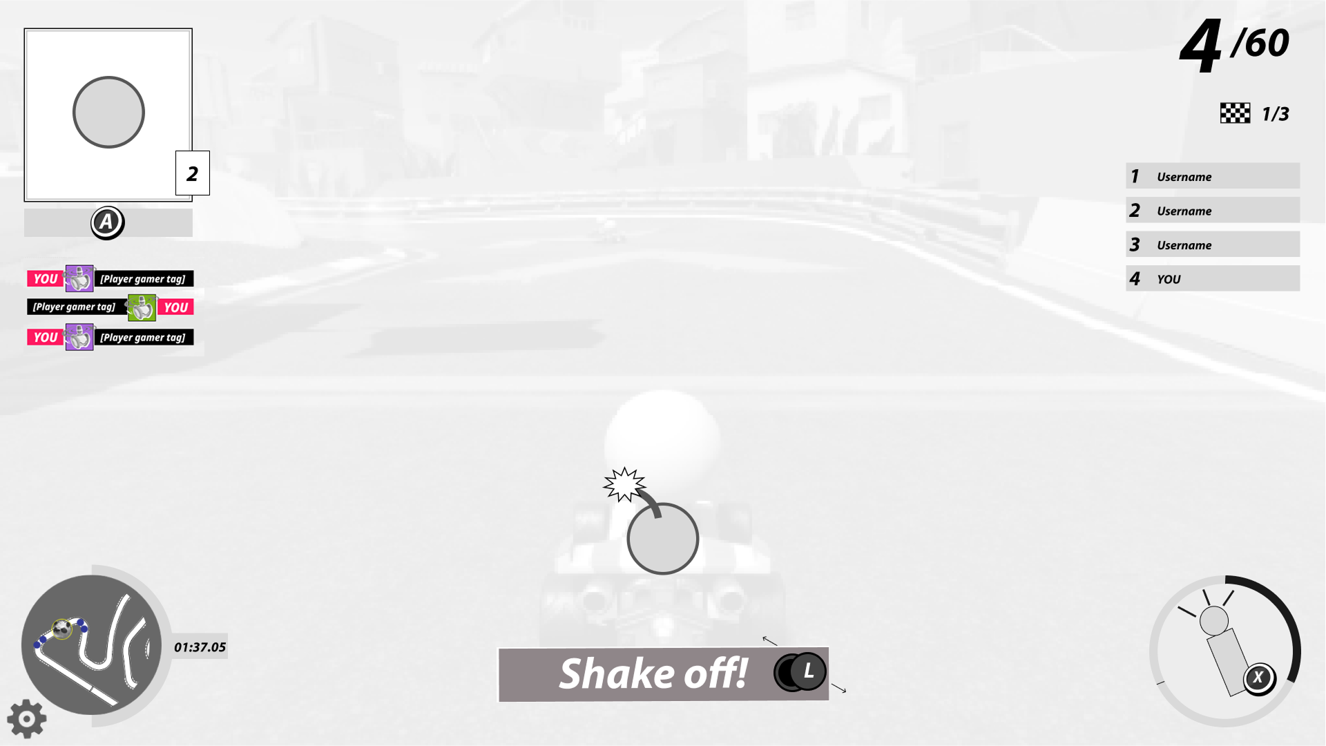
Powerup Communication
I had ownership of power up design, updating it on the second revision. Some of the changes we implemented:
Rework on controller input buttons to use when you are attacked by a powerup. A rule was created to keep it to a one button input maximum. As with the wireframe above, the “shake off” controller prompt was changed to the left joystick so that player could mimic the “swerve” motion when the sticky bomb was stuck on their character. This prompt was animated to indicate that movement in any direction can have the intended impact. This added immersion whilst also allowing them to continue driving with the right joystick.
Redesign of the “current powerup held” UI on the top left. The border now matched the rarity of the powerup and a counter was included.
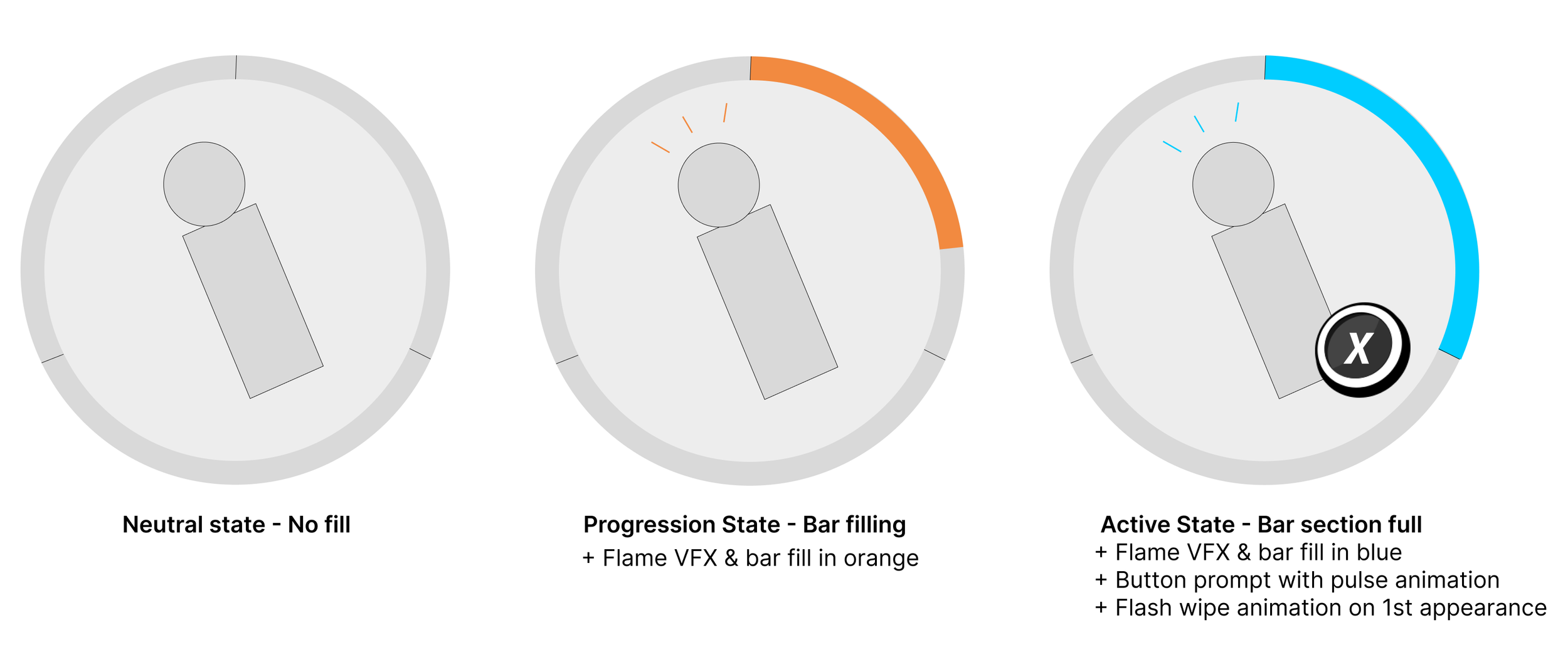
Boost Bar
To make the moment to moment racing more enticing, I designed the UX of the boost system. This worked so that by drifting, the player could accumulate 3 boosts. It was important to make it clear when the boost bar was filling vs usuable, designing the visual for this was super fun!
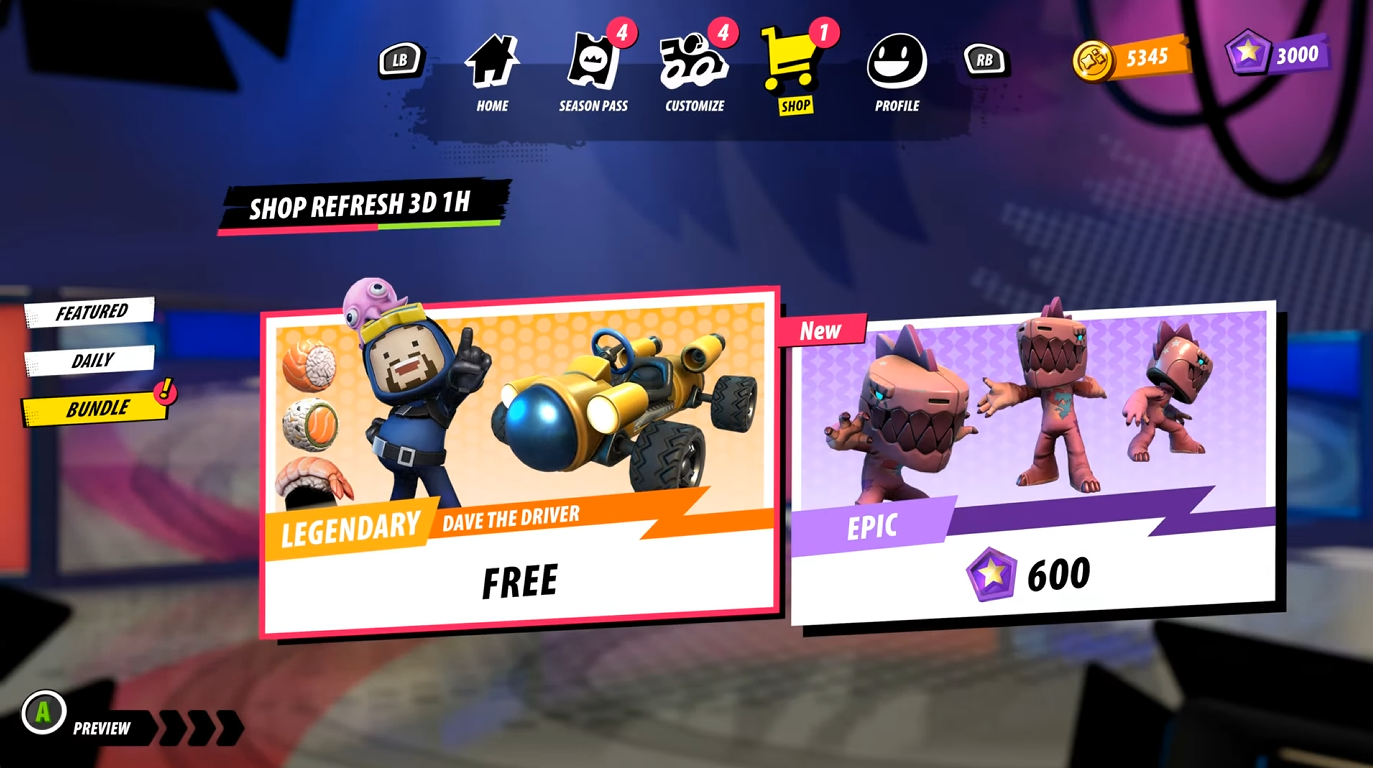
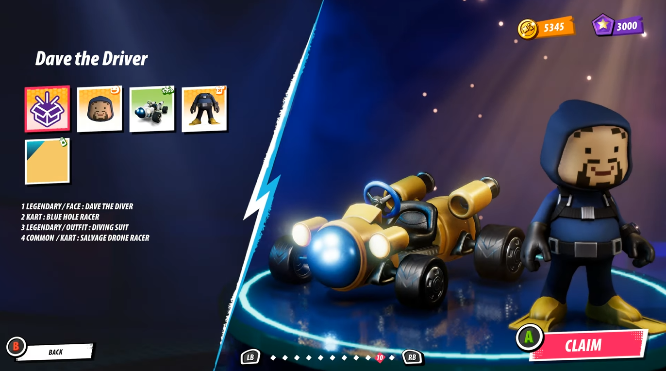
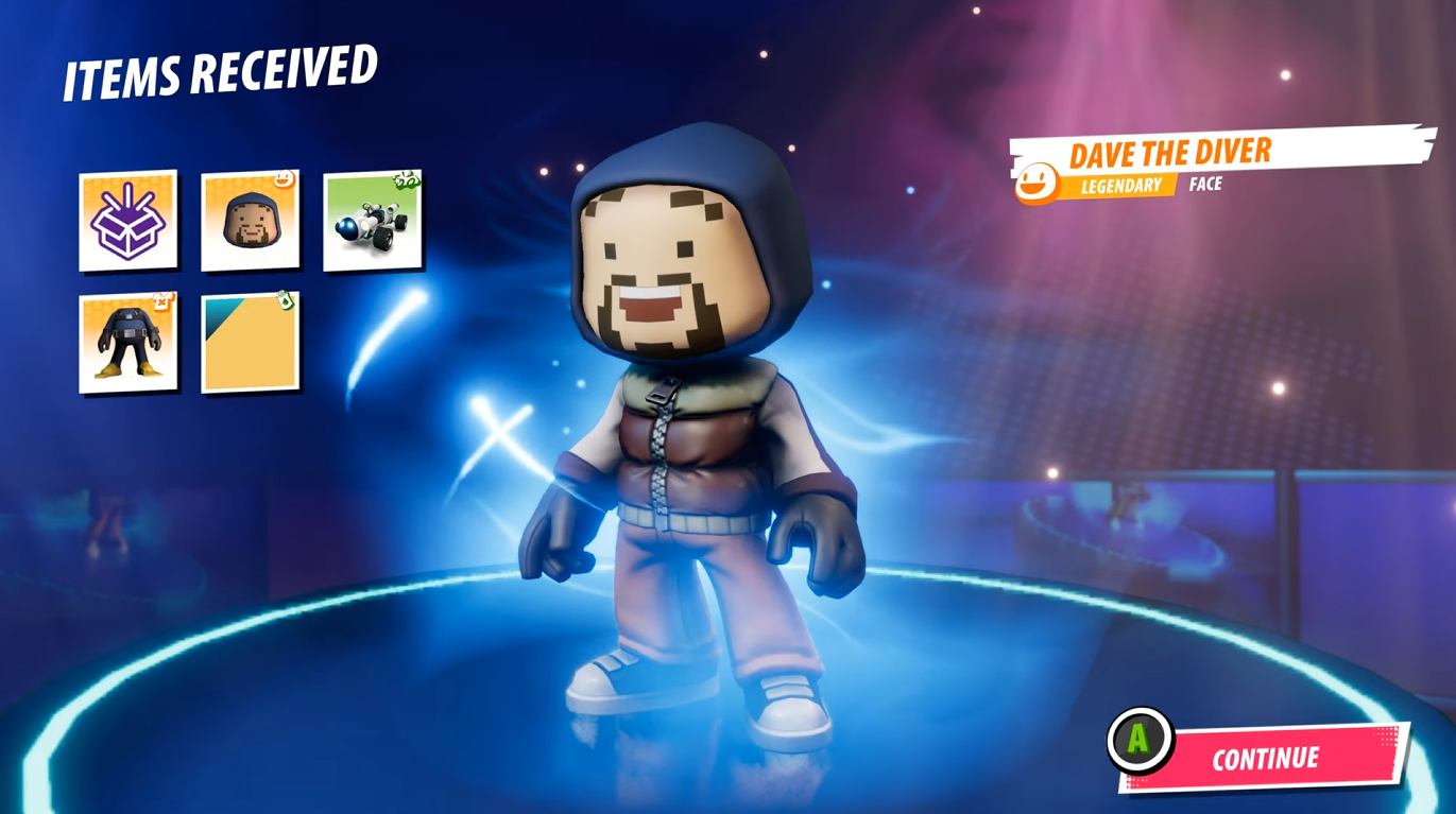
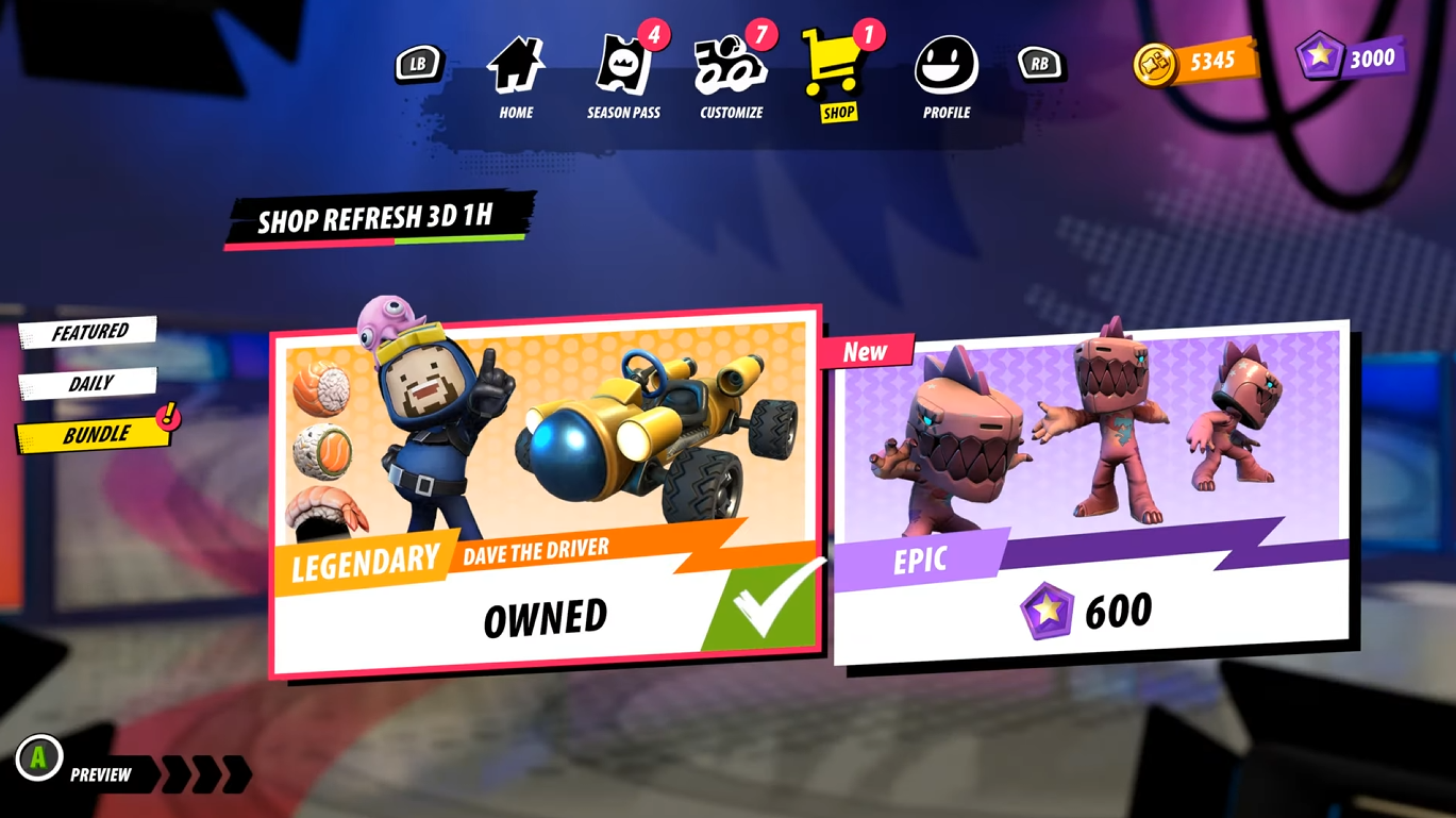
Dave the Diver - IP Collaboration
Working on this feature was an example of where a quick and smooth workflow was essential. I created rough sketches of what the purchase flow would look like and explored how we could highlight the IP in a fun way. This was then followed by detailed mockups using UI assets to create a true to show vision of how the final screens should look. I worked closely with the UI designers and Code team to ensure the content could be implemented and was authentic towards both brands. This process gave me a solid understanding of decision making with limited time, creating priorities and quick UX wins where possible.
Season Pass
The season pass was revised with consideration for the introduction of the premium pass. I worked on:
Updating the season pass page to include labels and iconography to differentiate between both pass types
Designing a mockup of the pass purchase page, comparing the passes side by side so that the player understood what their money could be spent on
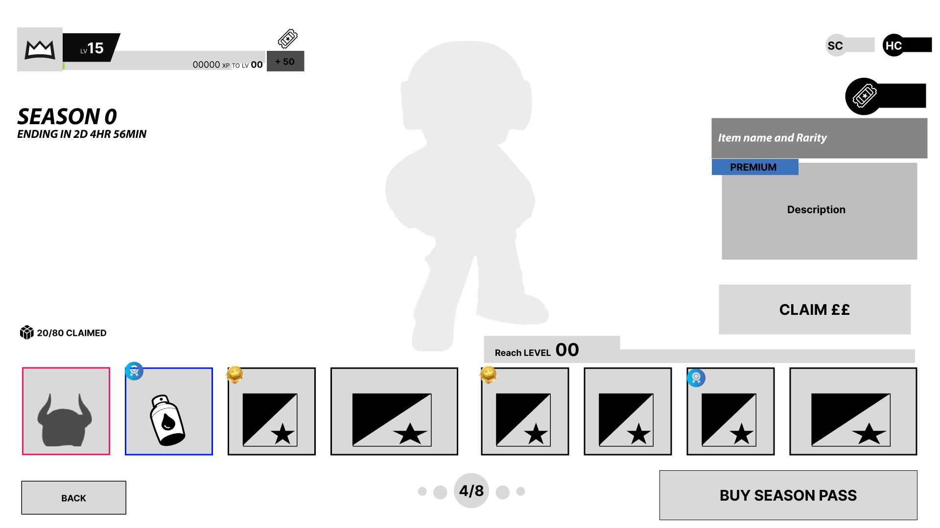
Season Pass Wireframe
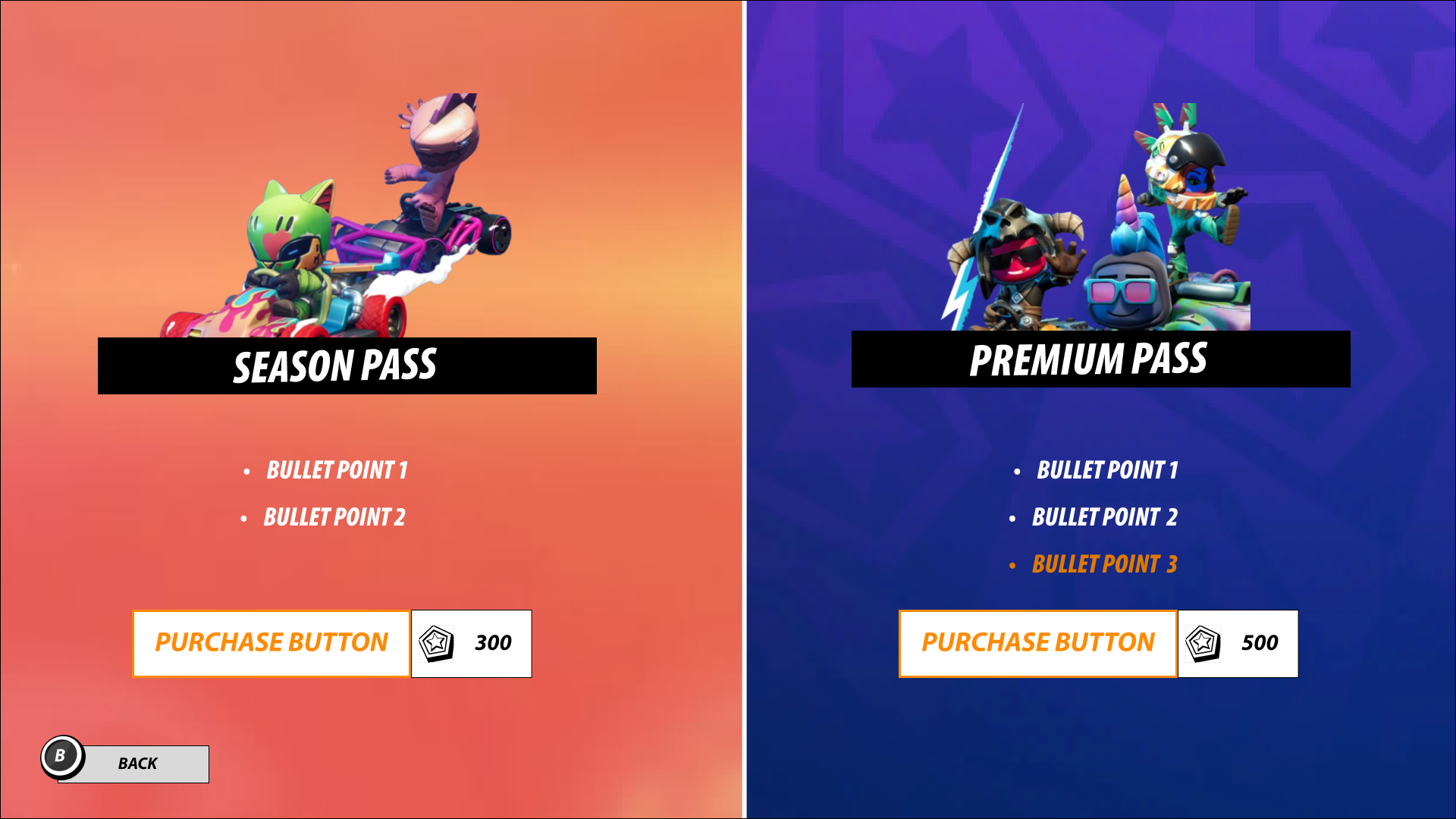
Pass Purchase Screen
Kart Boost / Bonus
The Kart Boost (later renamed to Bonus) feature aimed to encourage players to rotate karts they played with by incentivising them with additional XP.
Visual styling focused on making the boost obvious and enthralling
We went for bright colours (orange / yellow ) and flame iconography to indicate a boost to existing gameplay in a playful way.
A pop-up to explain the complexity of the feature in a simple way
The kart and party bonus features were implemented at the same time with a similar underlying principle that engaging with the game in a particular way will provide additional XP. Both concepts needed to be explained, associated iconography shown and state indicated. Because of this, I designed a pop-up that the player can access at any time to refresh their memories.
Reminders of Kart Boost state and impact where possible
On the home page, kart customisation and end of round screens we added prompts for how many rounds the current kart bonus would remain as well as how a bonus being active impacts reward output at the end of a match. This would keep the bonus perks salient in player minds, with clear indication of how long the current bonus would last.
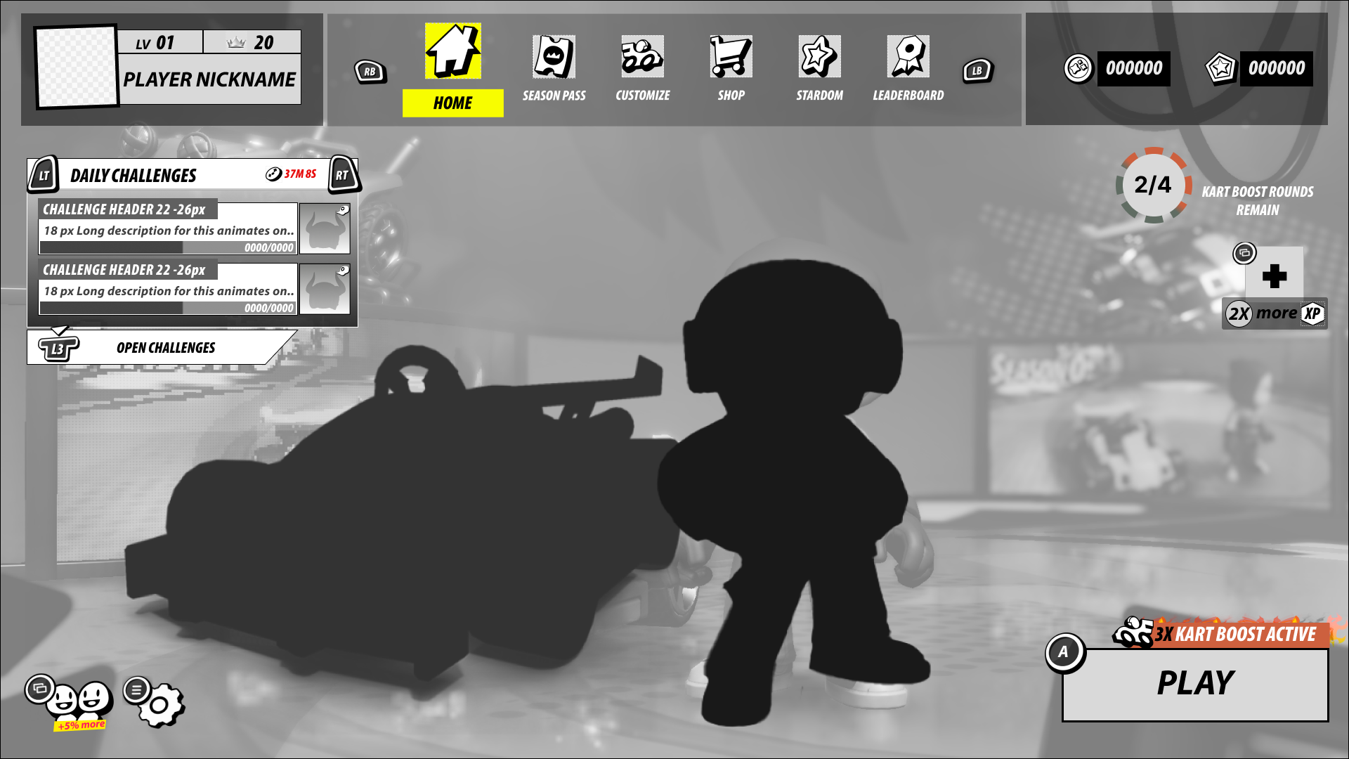
Kart Boost / Bonus information on the home screen
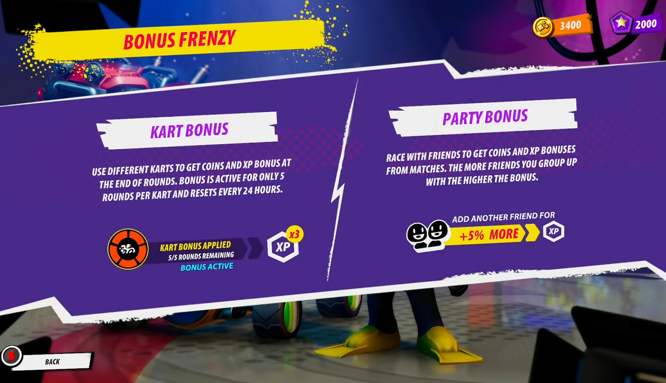
Pop-up explaining Kart Bonus
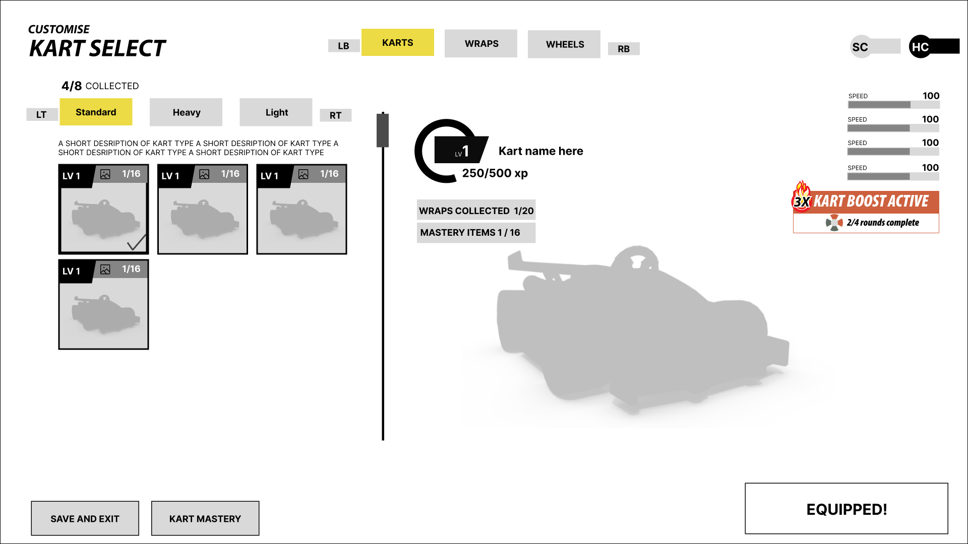
Kart Boost / Bonus status on the kart customisation page
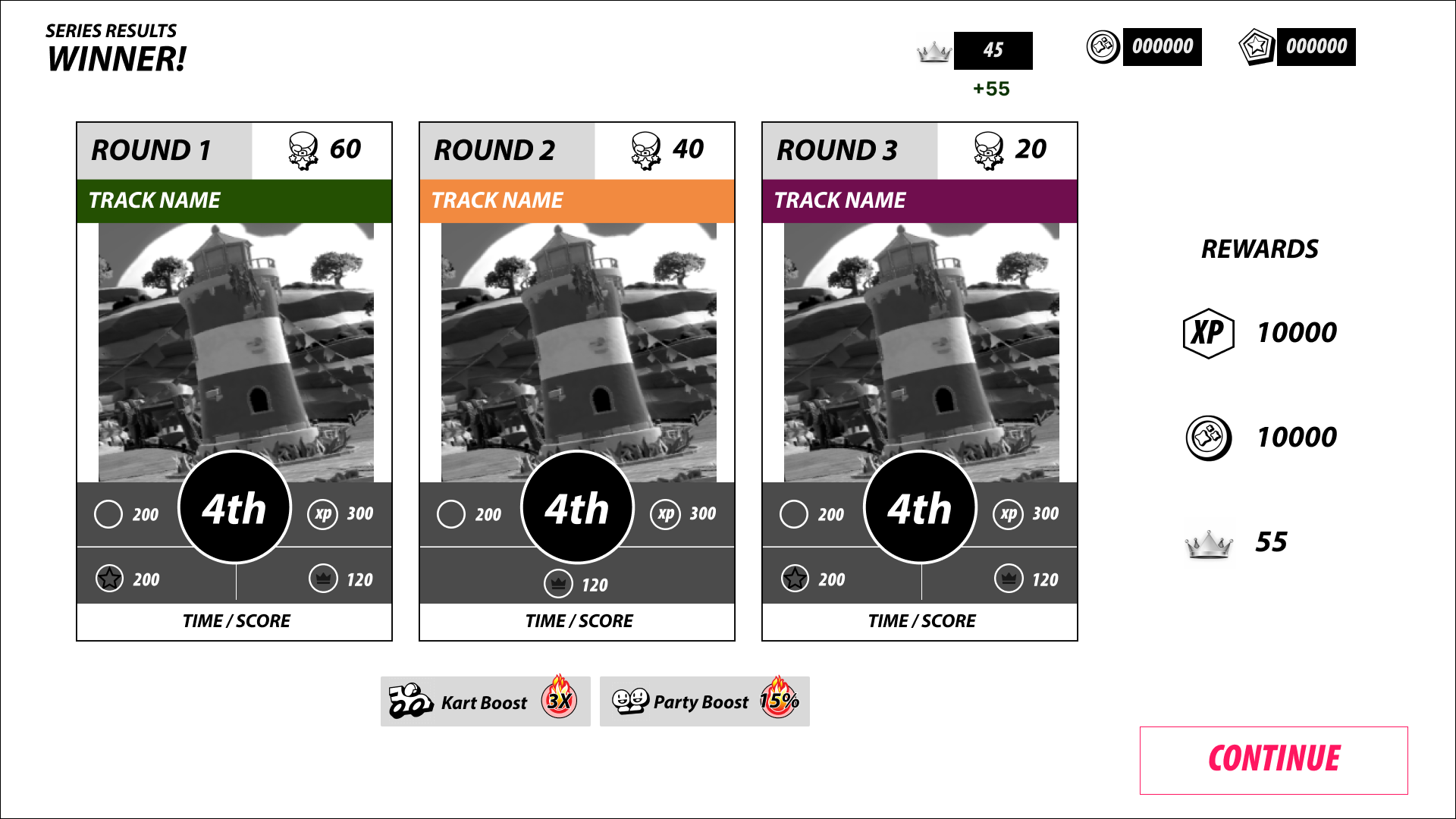
Kart Boost / Bonus multiplier on the results screen
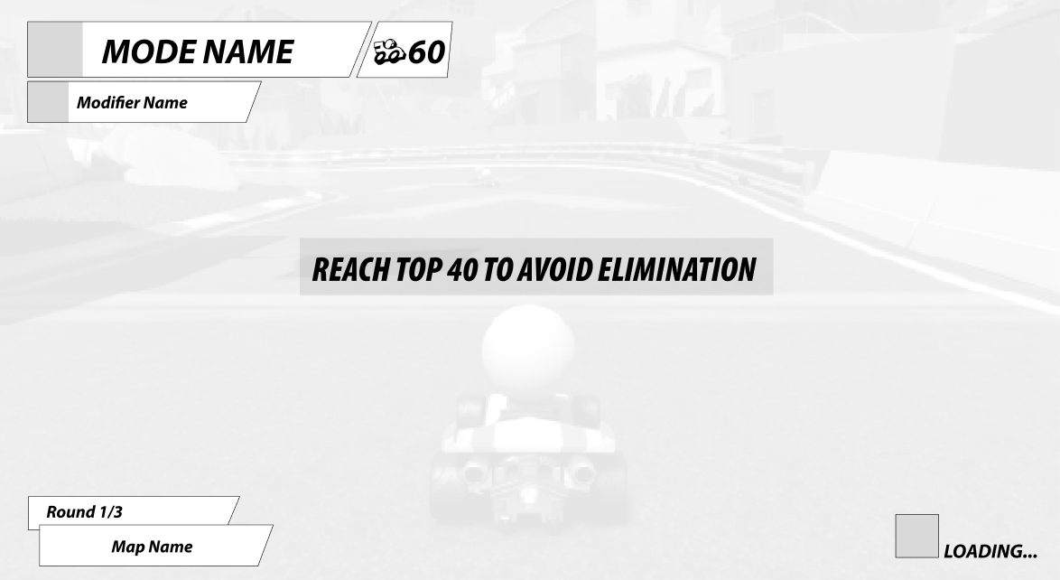
Mode Information
The pre-match flow was initially lacking in clearly signposting of mode information. I redesigned the flow to:
Include explicit labels for track name, current round, number of player characters
Introduce the modifiers subheader, listing out modifiers for the round with unique icons per mode to minimise text where possible
Modifier information was presented as a list with consideration for that fact there could be multiple modifiers per round in the future
Include a camera flyover before race start to show key landmarks, map breadth and possible hurdles
We wanted to use a “show don’t tell” format here
Suggest and got implemented diegetic player goals before race start that explicitly stated elimination criteria and dangers
This was to communicate mode adjustments, race goals and motivate the player before the light turned green!

Pre match information screen
Camera flyover showing round information and goals
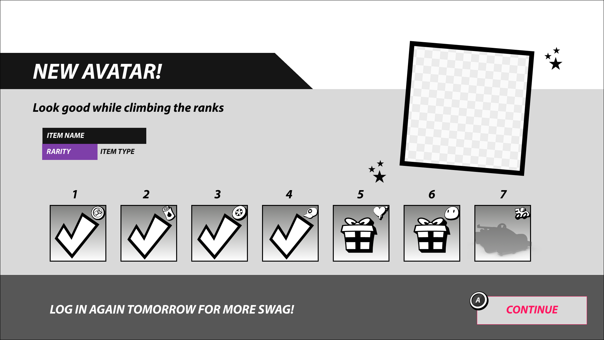
Miscellaneous Screens
Avatar Customisation Screen
Daily Calendar Screen: Appears on game load up showing daily rewards