Warhammer Combat Cards ✨ Well Played Games ✨ March 2019 - May 2019
Project: The project involved providing a UX consult on the F2P mobile game whilst it was in soft launch.
Responsibilities: The goal was to review the current user experience and provide suggestions for improvement. I was involved in game analysis, UX design and high level game design suggestions for the FTUE.
The Brief
The team at the time had no UX/UI support and primary concerns (based on conversations with the CEO and Design team, plus some preliminary research on app store reviews) included:
FTUE design: Assess the flow and learnability from and UX and usability perspective and identify areas of improvement
UI design: Is the current layout and palette of the UI appropriate, usable and accessible?
Communication of system changes: Progression and Rewards feedback
Feature specific reviews: Looking at the interaction design of menus
Audience confirmation through market research: I was able to confirm the demographic, their interests and what they’re looking for in a future game. Findings were presented in the final report.
Given the time limit and broad range of concerns I decided to conduct a heuristic evaluation and market research. This method would enable me to find key usability and experience concerns that could be avenues for change and have a big impact. I used the 7 usability heuristics for Game UX in conjunction with Playability Heuristics for Mobile Games for platform specific guidelines.
The HEURISTIC EVALUATION Process
I played through the FTUE multiple times, going through each screen with reference to the guidelines as well as each “round of card battle” till the end of the tutorial. This was to assess how teaching, feedback and expectations change from start to end, whilst observing if the core gameplay loop was clearly communicated. I noted positives as well as 36 issues that spanned all 7 heuristics which were prioritized based on urgency and importance to fix using the observation matrix below. This enabled me to report the most pressing issues first that could also have the biggest impact once solved. For each concern, I noted the problem, cause, impact on player experience and my actionable recommendation.
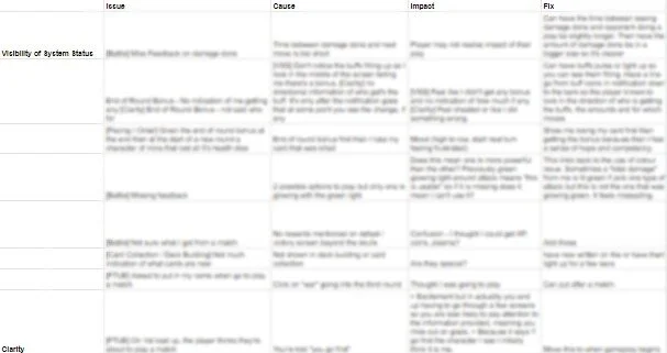
Snippet of the spreadsheet where all issues were collated. “Fix” refers to actionable recommendations and suggestions.
Mapping issues FOUND
Most concerns were centered around the heuristics of: Consistency, Clarity, Minimum Workload and Signs and Feedback. Below shows some issues uncovered.
2. Clarity
Players are told they have 2/2 of a card and the bar has turned green. However it’s not clear what this means (that they can upgrade the card).
1. Visibility of System Status / Signs and Feedback
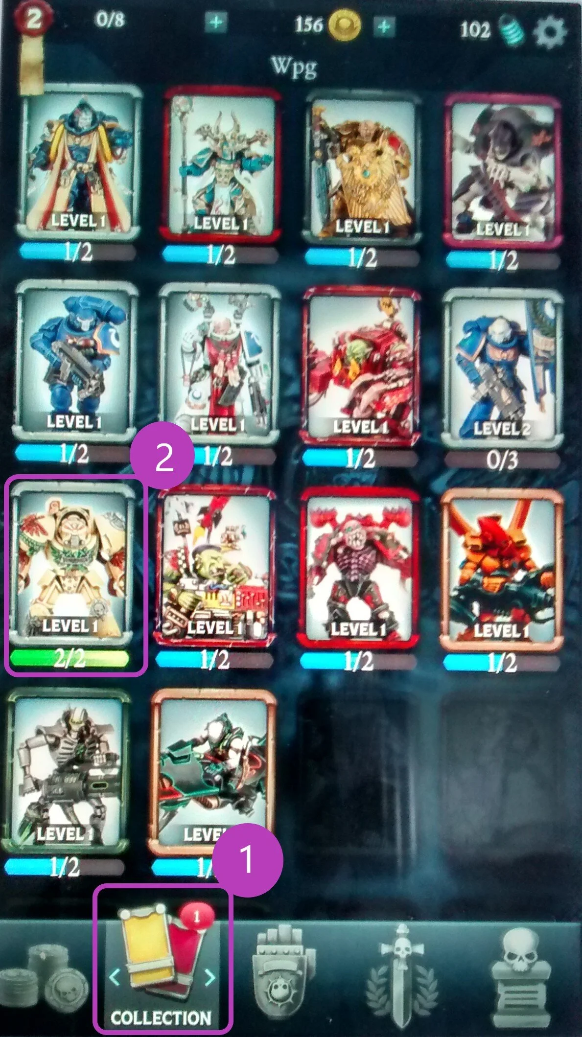
In the card collection screen, there’s a notification to indicate that there is a new card to see. But when scrolling through, it’s unclear which card this is.
4. Consistency
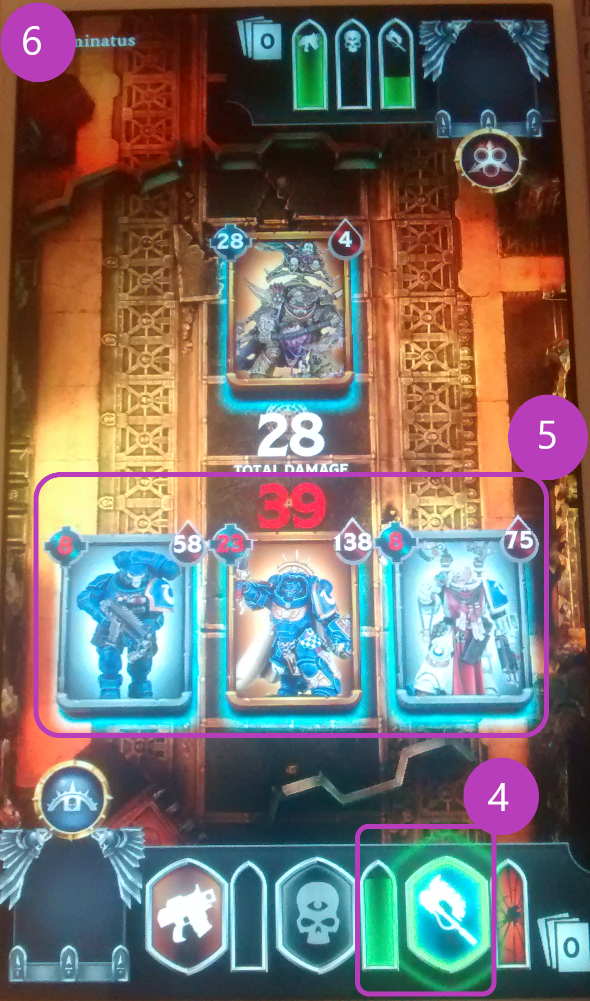
The UI colour palette was heavy on red, green, white and blues. Specifically green had multiple meanings during battles (buff, amount of damage you could do, nudging players to do an action and the bar indicating how much “energy” the have left for each turn).
3. Form Follows Function
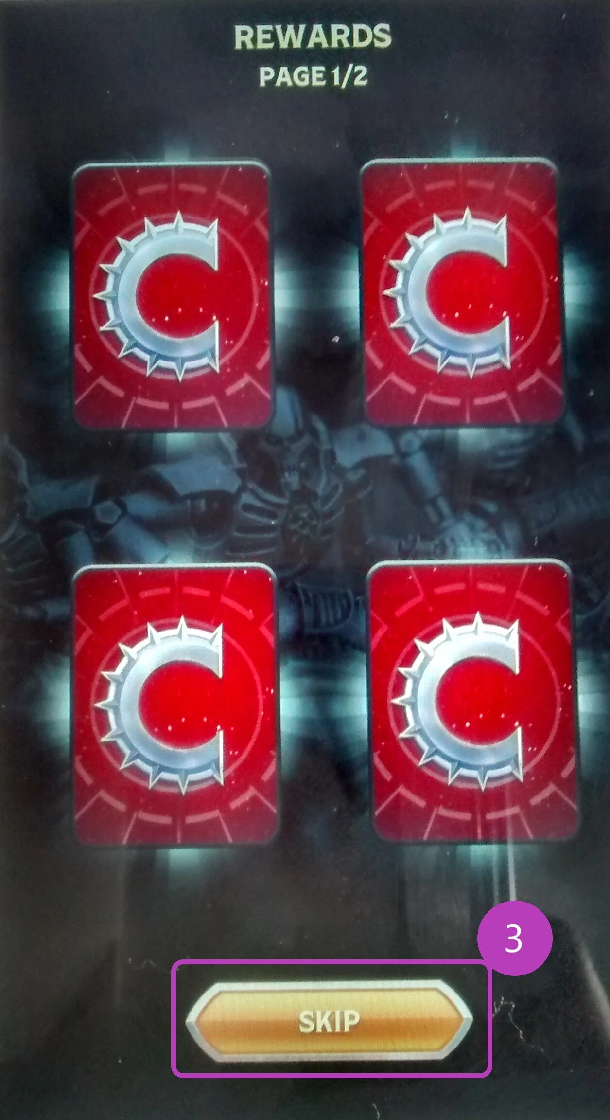
When a chest is opened, a rewards screen appears. They can tap “skip” which implies they can skip card reveals. When they tap on the button, it actually flips each card over with each tap. Therefore what the button presents itself as doesn’t follow the function.
6. Error Prevention / Recovery
Once in a battle, there was no option to exit or pause. If players had accidently started a battle, they had to complete it to leave.
5. Minimum Workload
Heuristics 4 and 5 relate strongly. Remembering different functions of a colour is overwhelming. There was an ‘overload’ of the red colour (debuff, positive congratulatory messaging, damage you can take, colour on the back of the cards) and unclear if the purpose was positive, negative or neutral.
7. Flexibility
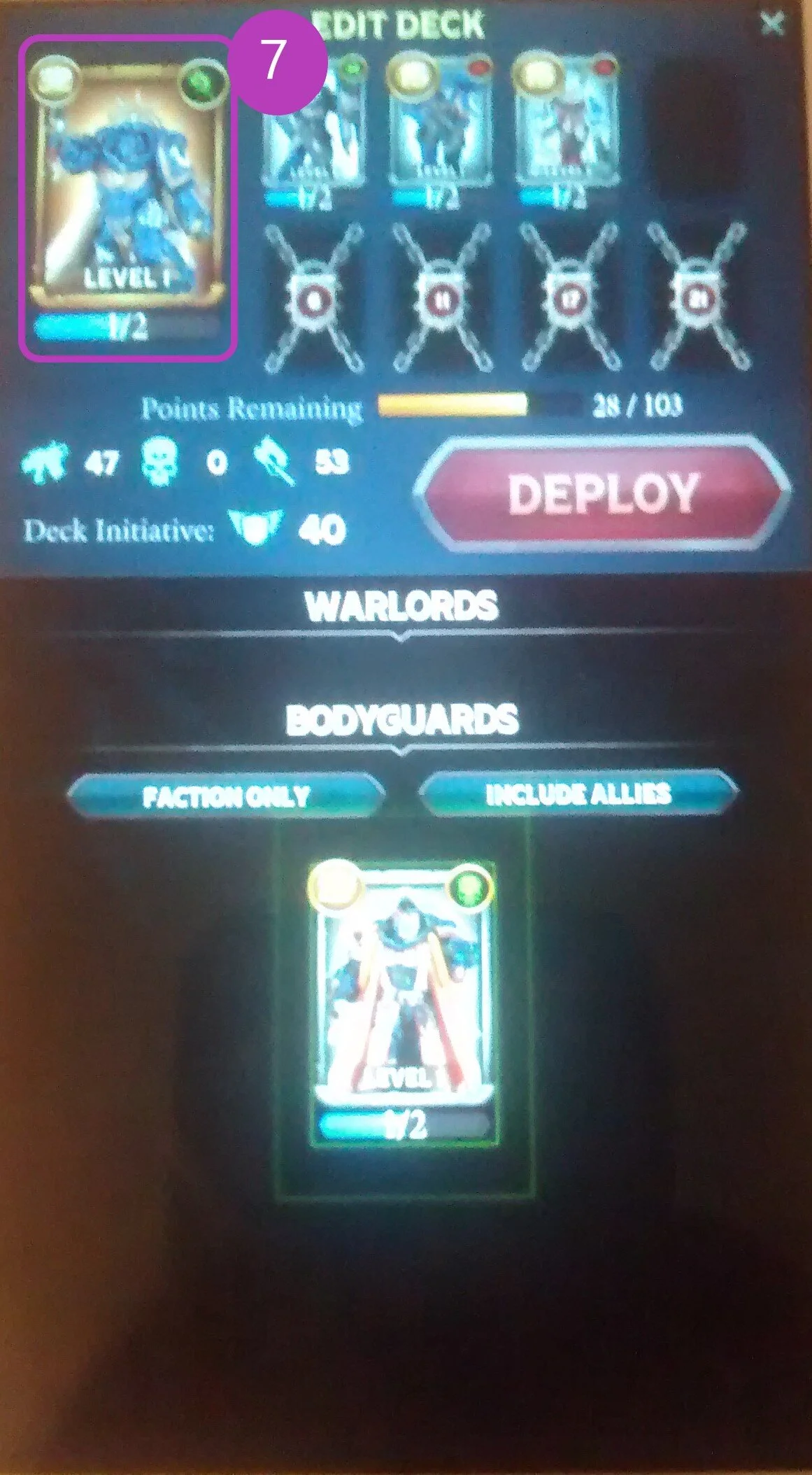
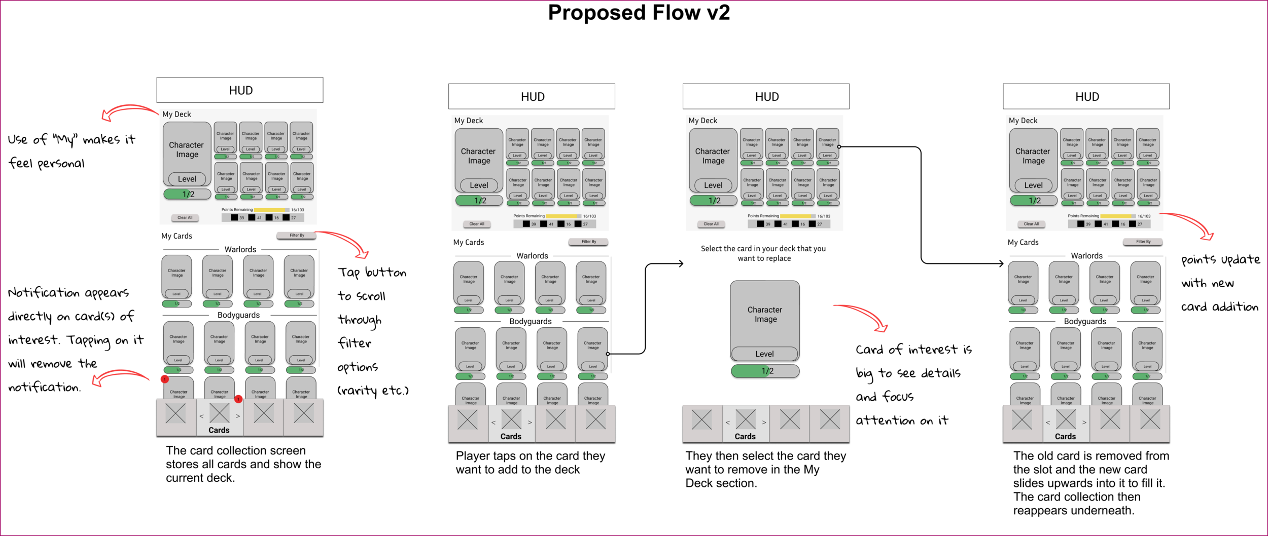
There’s only one interaction method to swap out cards in a deck and it was lengthy. At the moment, players tap on the right of a card in their deck at the top to remove it, then scroll the list below to find a card of interest, tap on it, then tap the slot to fill. This UI was small and hard to read too.
Presenting Solutions
As the heuristics are research specific terms, I used broad themes of Clarity, Pacing and Progression with reference to examples of each when presenting results in a slide deck. This made it clearer which systems were involved, where most of the issues lie and how the “cause” or “reasons” for an issue can impact various features. For each concern, I gave an idea of a possible solution to explore whether this was referencing competitor titles I found through research, encouraged further discussion and provided starting points or designed a solution myself.
Some of the problems I devised flows and wireframes for were:
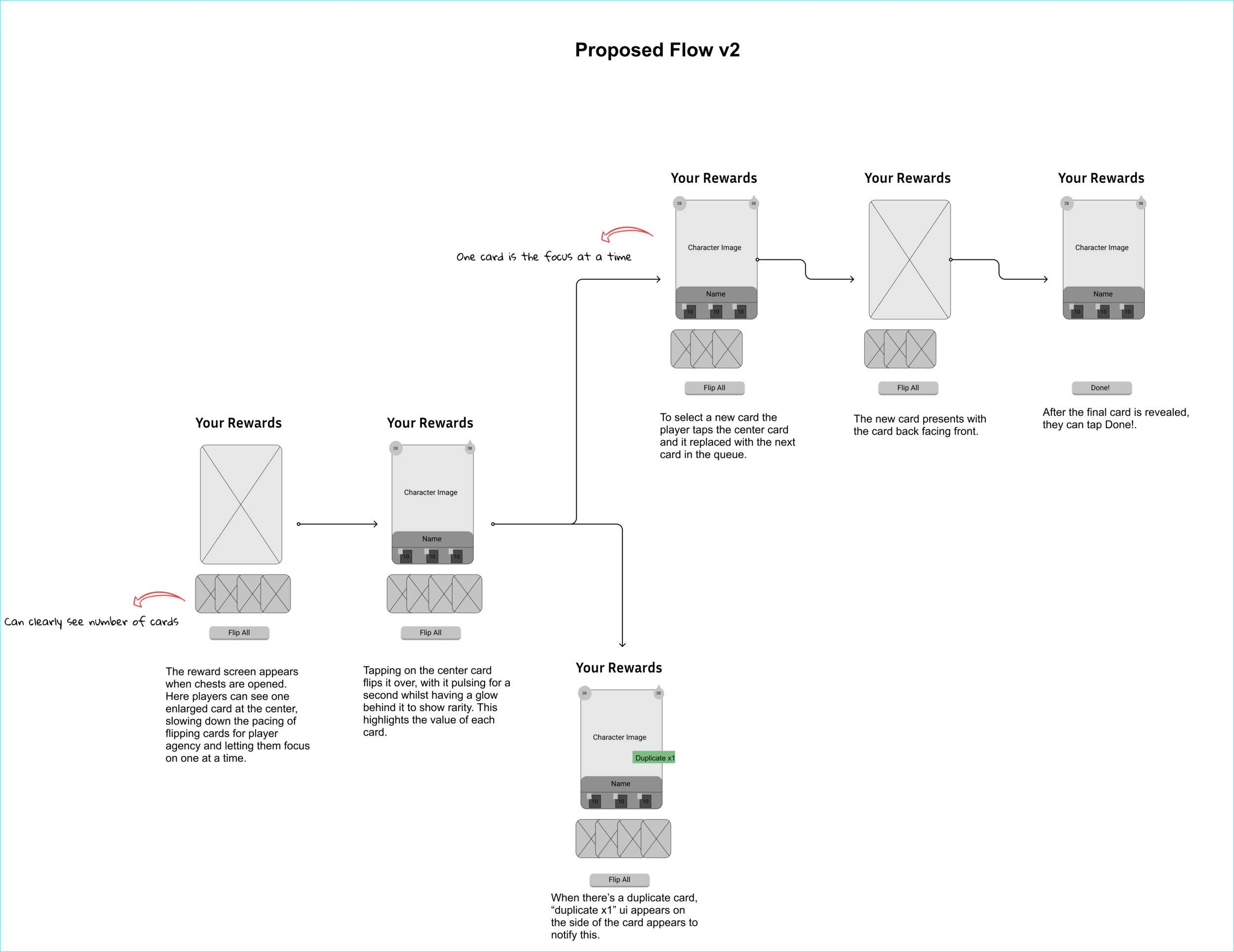
Chest opened screen: The reward feedback did not feel exciting and copy was unclear about how to engage with the screen. (For game feel and learnability)
The process of building a deck: It was hard to understand how to swap out cards and how to interact with them. (Big task but key to experience)
Notification design: Have clearer feedback for new items in the card collection screen. (Quick win)
These were sketched then developed into low-fidelity wireframes that underwent iterations and shared to the design team.
Chest Opened Screen
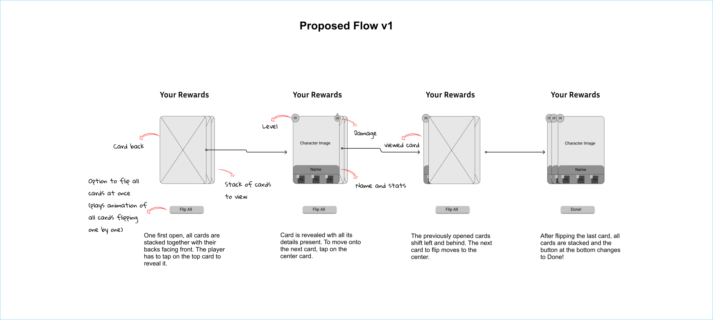
Solution critique:
The function of stacking was to show how many cards there are to see however, they are stacked tightly, meaning this design would not be the most readable if there were more than 4-5 cards to show on screen.
It’s hard to tell where to pay attention in screen 3, where the viewed card shifts to the left. Does the player look at the center or the shiny card on the left? This distracts from the aim that the player should focus on one card at a time.
In the final screen, the only thing you can learn about the cards behind the top one is their level. At this point it is redundant and results in encouraging the player to compare cards and their value when the goal is to create the feeling that they’re all special.
Deck Building Flow
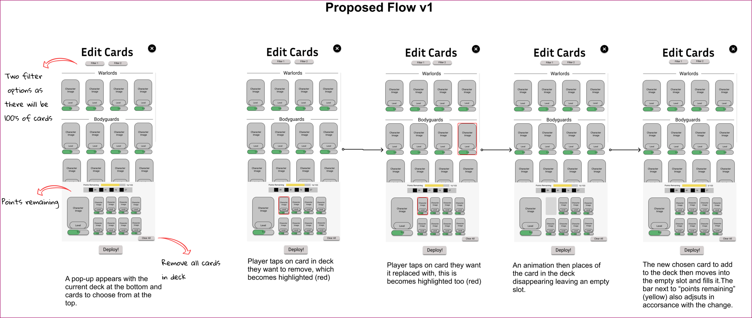
Solution critique:
In portrait mode, the bottom half of the screen is easiest to access because of how people hold their phones, therefore because scrolling the card collection requires regular interaction compared to the deck, the current hierarchy is not the most appropriate
The deck section heirarchy means players read about points remaining first which is less important than viewing the cards present
There is no clear way to view the full card collection and deck outside of when you are preparing to go into battle, which minimizes opportunities for deck and card explorations.
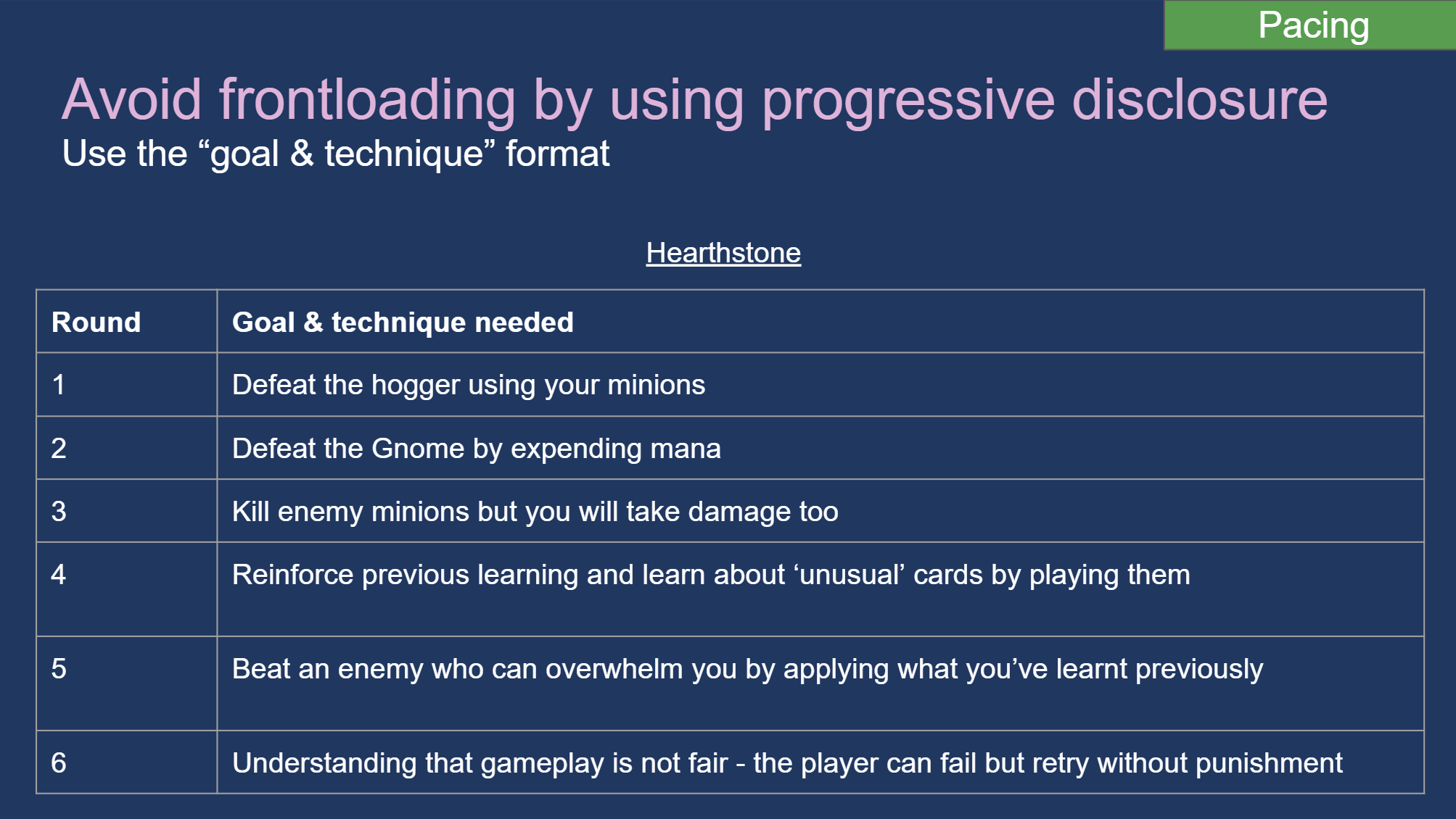
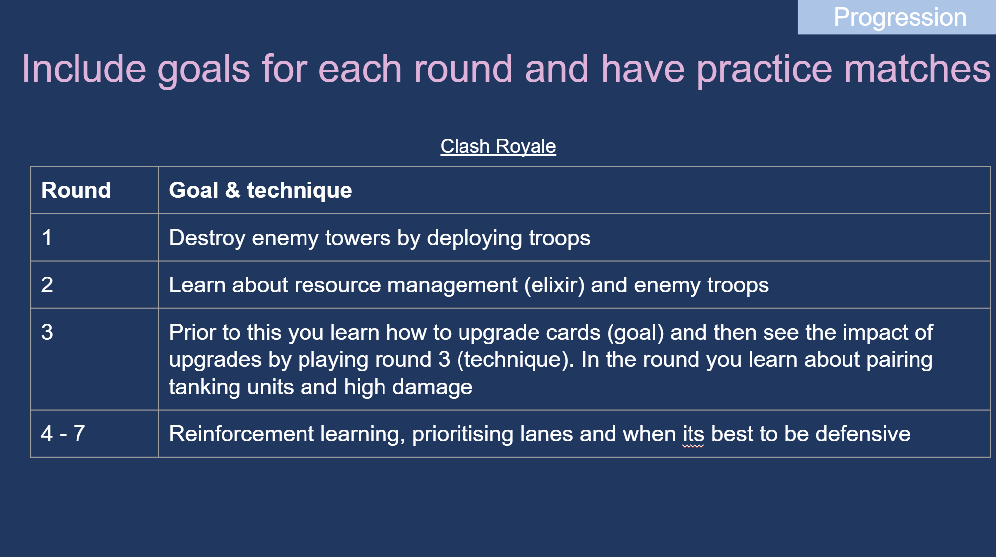
FTUE Progression
I wasn’t able to go in as deep as I would have liked to with reworking the FTUE however I found that there were issues around pacing of teaching (lots of frontloading) and creating a clear sense of progression (it wasn’t clear what the overall goals were per round). I researched the FTUE of competitor titles and found that for each round of play during the tutorial, players are always given a new goal and technique to learn that builds upon the previous round. This provides a reference model of how to break down the teaching process and prioritising what’s important to teach when.
Lessons I learnt
You can find lots of usability and experience issues in a game, prioritise the ones that are most important to resolve for player experience but also business needs. Above I found a long list of issues, but I presented them in such a way that considered which are most critical, could impact retention and some of which were quick wins. The aim wasn’t to give all the problems found at once, but instead organise them in such a way that they were actionable.
Be clear about your decisions. If pitching a solution, ensure the team understand why you made the decisions you did, it will aid communication and build trust in the UX process.